How to Customize the Design Layout of Your Knowledge Base in SupportGenix
The Design Layout settings in SupportGenix allow you to fully control the appearance and structure of your Knowledge Base. You can configure how articles are listed, displayed, and styled to match your website’s branding and user experience preferences. In this guide, we’ll walk you through each section—Base, Archive, Single, and Style—so you can easily tailor your Knowledge Base layout.
Step 1: Access the Design Layout Settings
From your WordPress dashboard:
- Go to Support Genix in the left sidebar.
- Navigate to Support Genix > Configuration > Design Layout.
- You’ll see four layout options: Base, Archive, Single, and Style.
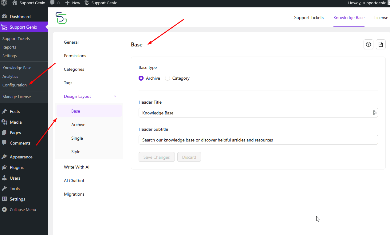
Base Layout Configuration
The Base section allows you to set the general entry point and heading content for your Knowledge Base.
- Base Type:
Choose between:
Archive (default): Displays all articles grouped together.
Category: Starts with article categories instead of a general listing. - Header Title:
Enter the main title shown at the top of your Knowledge Base page.
Example: Knowledge Base - Header Subtitle:
Add a short description or search prompt under the title.
Example: Search our knowledge base or discover helpful articles and resources - Click “Save Changes” after configuring this section.

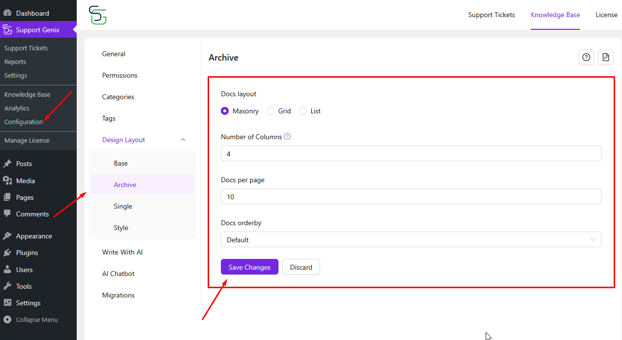
Archive Layout Configuration
The Archive section controls how articles are listed when viewed in bulk.
- Docs Layout:
Choose the visual layout for documentation: Masonry (default), Grid, List - Number of Columns:
Set how many columns are shown (e.g., 3) when using Masonry or Grid view. - Docs per Page:
Define how many articles appear on a single page (e.g., 10). - Docs Order By:
Choose the order in which articles appear: Default,ID,Author,Title,Slug,Random… - Save your changes to apply the selected layout.
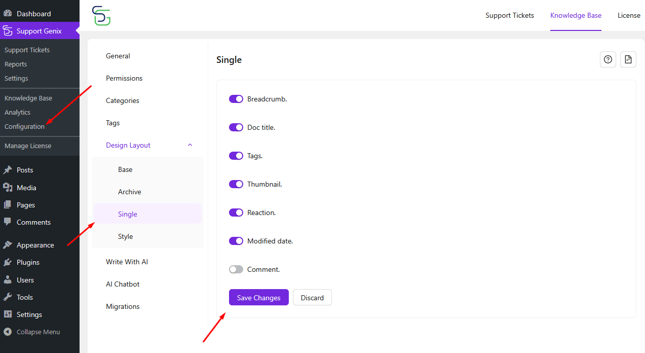
Single Article Layout
The Single section allows you to manage what appears inside each article page.
Toggle the following options ON or OFF based on your preference:
- Breadcrumb: Show navigation path to the current article.
- Doc Title: Display the article title at the top.
- Tags: Show tags associated with the article.
- Thumbnail: Display the article’s featured image.
- Reaction: Enable readers to react to the content.
- Modified Date: Show when the article was last updated.
- Comment: Allow users to leave feedback via comments.
- Customize each toggle to improve readability and interaction.
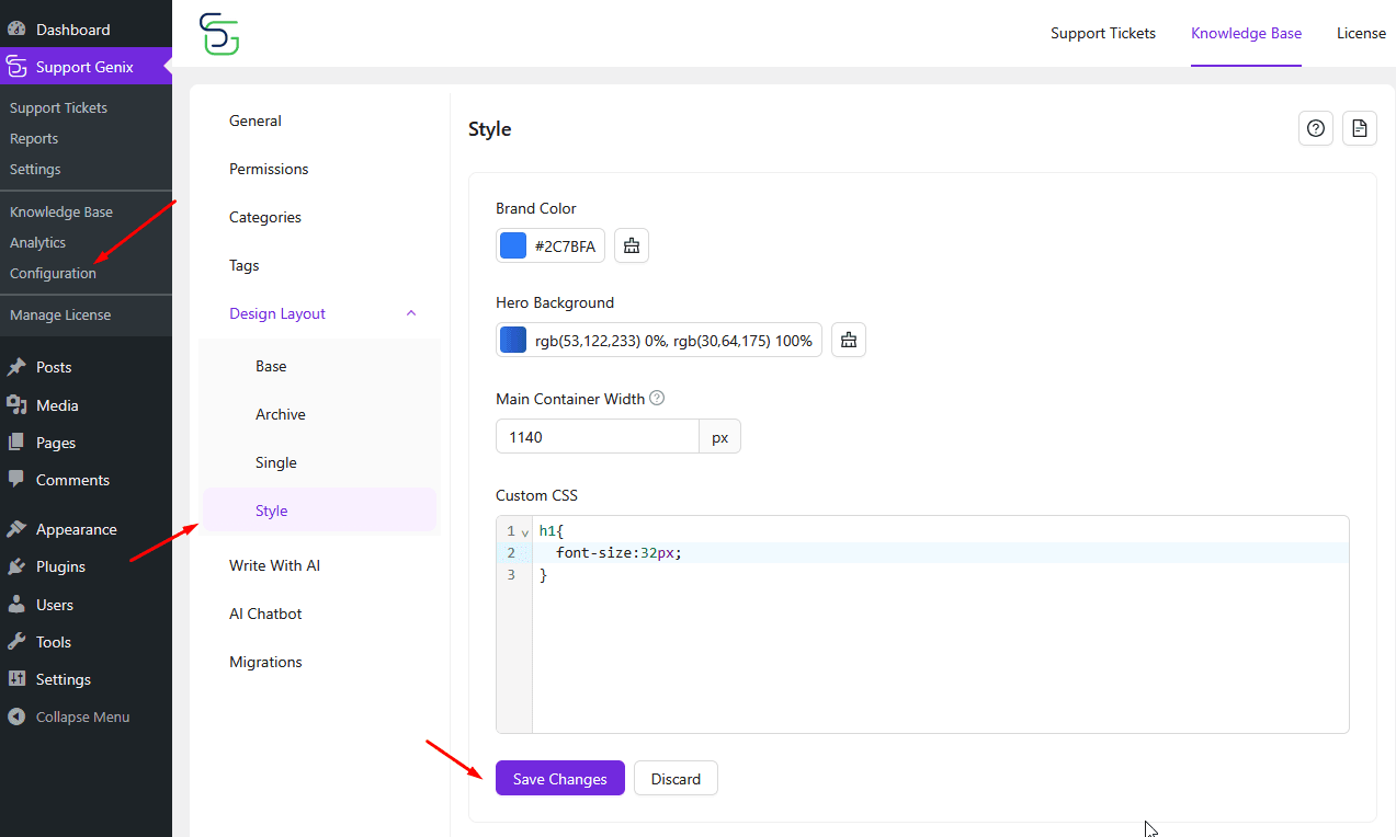
Style Customization
The Style section allows you to match the Knowledge Base with your site’s design.
- Brand Color:
Choose the primary color for links, buttons, and highlights.
Example:#3B82F6 - Hero Background:
Customize the background gradient behind the header title.
Example:#3b82f6 - Main Container Width:
Define the width of the Knowledge Base container.
Example:1140px - Custom CSS:
Add your own CSS for advanced design customization. - Click “Save Changes” to apply all style updates.