15 Best Knowledge Base Examples to Inspire Your Help Center in 2026
Customers hate waiting for answers, and your support team hates answering the same “how do I reset my password?” ticket for the 500th time. A well-designed knowledge base solves both problems instantly.
In fact, 91% of customers would use an online knowledge base if it were available and tailored to their needs. Yet, many companies treat their help center as an afterthought, a dusty folder of PDF manuals that nobody reads.
The best knowledge base examples don’t just store information; they actively deflect support tickets, improve customer satisfaction (CSAT), reduce operational costs, and serve as a 24/7 self-service engine that compounds in value over time.
Below, we’ve analyzed 15 of the best knowledge base examples for 2026, starting with the most integrated solution for WordPress users: Support Genix. Whether you’re managing a small support team or scaling a global operation, this guide will show you exactly what works—and why.
Table of Contents
Key Takeaways
- Support Genix leads the list as a fully integrated, AI-powered WordPress solution.
- Search functionality is the single most critical feature for ticket deflection.
- Clean navigation beats flashy design every time—users want answers, not art.
- Internal vs. external knowledge bases require completely different structures.
- AI-powered docs are becoming the standard, not just a “nice-to-have”.
- Analytics turn article views into actionable product insights.
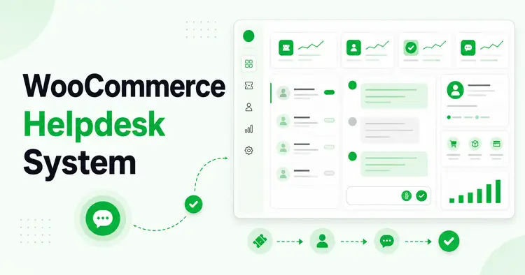
Support Genix
WordPress Support Ticket Plugin
Take Your Customer Support to The Next Level and Boost Customer Satisfaction Rates
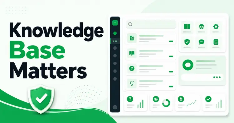
What Makes a Great Knowledge Base?
Before we dive into the examples, let’s define what actually makes a knowledge base work. A pretty interface is useless if customers can’t find the answer in under 30 seconds.
A high-performing knowledge base must have four critical components:
1. Instant Searchability
Users should find the right article even if they make typos, use synonyms, or phrase questions differently. A search for “bill” should find “invoice.” A search for “login” should find “sign in.” This is called “fuzzy matching” and it’s non-negotiable.
2. Clear Information Architecture
Content must be organized logically with Categories, Tags, and Parent/Child relationships. If a user can’t browse their way to an answer, search alone won’t save you. The best knowledge base examples use 5-8 main categories, not 50.
3. Scannability & Visual Hierarchy
Articles need Tables of Contents, bullet points, and clear headers, no walls of text. Users are scanning, not reading. They want to find the relevant sentence in 10 seconds.
4. Strategic Integration
The best tools suggest relevant articles while a user is typing their support ticket. This is called “ticket deflection,” and it’s the most powerful feature a knowledge base can have. If an article answers the user’s question before they even submit the ticket, you’ve won.
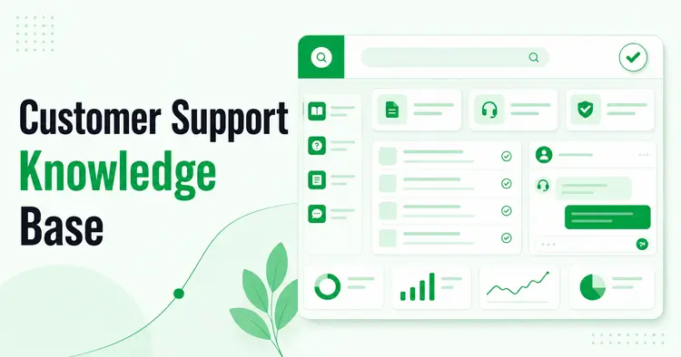
15 Inspiring Knowledge Base Examples (The Definitive Guide)
We’ve curated this list to cover every use case: from WordPress plugins to SaaS giants, ecommerce leaders, and developer platforms.
1. Support Genix: The All-in-One WordPress Solution
If you run a WordPress business, Support Genix is the gold standard for integrated knowledge bases. Unlike standalone SaaS tools that cost hundreds of dollars per month, Support Genix lives directly inside your WordPress dashboard, connecting your documentation with your ticketing system, AI chatbot, and customer relationships.
Why this example works:
- AI-Powered Writing: You can use the built-in.”Write with AI” feature to generate SEO-optimized support articles in seconds using OpenAI and Claude models. This cuts your article creation time by 80%.
- Ticket Deflection at Scale: When users type a subject line in the support form, Support Genix automatically suggests relevant articles, stopping the ticket before it’s even submitted. This feature alone can reduce ticket volume by 23-40%.
- 24/7 AI Chatbot: It includes an AI chatbot that trains itself on your knowledge base articles to answer customer questions automatically. Your help center literally works while you sleep.
- BetterDocs Migration: If you’re already using BetterDocs, you can migrate everything to Support Genix with one click, preserving all your articles, tags, and metadata.
- Unlimited Articles: Unlike many competitors, Support Genix allows unlimited articles, categories, and tags. No paywalls. No artificial limits.
- Design Customization: You can customize the knowledge base layout (base template, archive view, single article view) and styling (colors, fonts, widths) without writing code.
Steal this idea: Don’t keep your knowledge base separate from your support inbox. Connect them so your agents can link articles directly in their replies, and so new customer inquiries automatically surface your best documentation.
2. Asana
Asana’s Help Center is a masterclass in task-based navigation. Instead of organizing by “features” (which users might not know the names of), they organize by “jobs to be done” like “Get Started,” “Manage Team,” “Track Progress,” or “Premium Features.”
Why this example works:
- Intuitive Categorization: Users think in terms of what they want to accomplish, not product feature names.
- Prominent Search: The search bar is the first interactive element on the page.
- Separation of Concerns: “Quick Start” guides for new users are separated from deep technical documentation for power users.
- Embedded Video: Video tutorials are embedded directly at the top of key articles, not hidden behind links.
Steal this idea: Think about your customers’ “jobs to be done” and organize your knowledge base around those, not your internal feature names.
3. Shopify
Shopify’s help center handles millions of merchant inquiries. Their standout feature is the ruthlessly clean categorization. They know exactly who their user is (a small business owner) and what they desperately need: payments, shipping, themes, and tax compliance.
Why this example works:
- Visual Categories: They use simple icons for categories like “Products,” “Payments,” “Shipping,” and “Store Settings,” making it instantly scan-friendly.
- Contextual Sidebars: Every article has a sidebar linking to 3-5 related topics, keeping users in a “learning loop” rather than sending them back to search.
- Mobile-First Design: The layout adapts perfectly for phone users, which represent 60%+ of their traffic.
Steal this idea: Use icons to represent your main categories. Humans recognize icons faster than text.
4. Stripe
Stripe set the bar for developer documentation. Their knowledge base is a hybrid of API references and “How-to” guides. Their secret weapon is the “split-screen” layout: instructions on the left, copy-paste code on the right.
Why this example works:
- Interactive Code: Developers can toggle between different programming languages and copy/paste code directly.
- Dark Mode: A small UI touch that developers love (reduces eye strain when reading docs at midnight).
- Version Control: Users can toggle between different API versions in one click.
- Searchable Code: The search index includes code snippets, so searching “fetch customer” returns relevant code examples.
Steal this idea: If your product has multiple integrations or APIs, let users filter by their specific use case or programming language.
5. Slack
Slack’s knowledge base matches their brand voice perfectly: helpful, friendly, and human. They avoid jargon. Instead of “Authentication Protocols,” they say “Sign in to Slack.” Instead of “Message Threads,” they say “Keep conversations organized.”
Why this example works:
- Human Language: They use the same words their customers use in everyday conversation.
- Tip Boxes: Colorful, styled boxes highlight shortcuts and pro-tips without cluttering the main article text.
- Personality: Reading a Slack help article feels like a conversation with a colleague, not a tech manual.
Steal this idea: Record actual customer support conversations. Use the words and phrases your customers use—then build your knowledge base vocabulary around those.
6. Dropbox
Dropbox combines their official help articles with their community forum. If an official article doesn’t answer a niche question, the search results also show relevant discussions from other users who solved the same problem.
Why this example works:
- Crowdsourced Answers: Community fills the gaps that the official team hasn’t documented yet.
- Feedback Loops: Users can vote on whether an article was helpful. Dropbox hides low-rated articles and promotes high-rated ones.
- Hybrid Trust: Official content builds credibility; community content shows that real people have solved the problem.
Steal this idea: Don’t try to document everything yourself. Let your community (customers, partners, or employees) contribute solutions.
7. Canva
It’s no surprise that a design tool has a visually beautiful knowledge base. Canva relies heavily on screenshots, GIFs, and short videos. They know their users are visual creators, not readers.
Why this example works:
- Minimal Text: Most articles are 60% images, 40% text. They show, don’t tell.
- Animated GIFs: Complex multi-step processes are shown via GIF instead of written steps.
- “Design School”: They blur the line between “support docs” and “educational courses,” adding brand value on top of deflecting tickets.
Steal this idea: Use one screenshot per step in your guide. Designers and non-technical users will find answers 3x faster with visuals.
8. HubSpot
HubSpot takes “knowledge base” to the next level by turning it into an Academy. They offer certifications and courses alongside standard troubleshooting articles. Users can earn “HubSpot Certified” badges, which they then proudly display on LinkedIn.
Why this example works:
- Upselling via Education: By teaching users how to do inbound marketing, they teach them how to use HubSpot tools.
- Gamification: Users get badges and certificates for completing “knowledge tracks,” turning learning into a game.
- Career Development: Users see the knowledge base as an investment in their career, not just a support channel.
Steal this idea: Consider adding a “certification” or “training path” option for your most important workflows. Users will spend more time learning your product.
9. Mailchimp
Mailchimp’s articles are famous for their numbered lists. Almost every article is a strict “Step 1, Step 2, Step 3” tutorial. This reduces cognitive load for users who are panicking about a broken email campaign.
Why this example works:
- Action-Oriented: No fluff, just instructions. Users know exactly what they need to do.
- Expandable Sections: Long articles use “accordions” to hide advanced details so beginners aren’t overwhelmed.
- Screenshots at Each Step: Every step has a corresponding screenshot showing what the user should see.
Steal this idea: Write every article with numbered steps. “How to…” articles should read like a checklist.
10. WhatsApp
Since most WhatsApp users are on mobile, their help center is designed for vertical scrolling. It looks like an app, not a website.
Why this example works:
- Responsive Design: Buttons are large and thumb-friendly. Tap targets are at least 44 pixels.
- Platform Specifics: Tabs let you toggle instructions between “Android,” “iPhone,” and “Web.”
- Minimal Navigation: The main menu is a hamburger menu, not a horizontal navbar.
Steal this idea: Test your knowledge base on a mobile phone before publishing. Mobile users should have the same experience as desktop users.
11. Notion
Notion builds its help center using Notion itself. This is brilliant marketing. It shows potential customers exactly what the product is capable of.
Why this example works:
- Product Demo: The help center is a demo of the product.
- Wiki Style: It feels collaborative and easy to navigate, just like a personal wiki.
- Real-Time Updates: Customers know the docs are always up-to-date because they’re built in the same tool.
Steal this idea: If your product can be used to create documentation, use it. It’s the ultimate proof that your product works.
12. Ahrefs
Ahrefs integrates its knowledge base directly into its tool. You don’t have to leave the dashboard to read a guide on “Keyword Difficulty” or “Backlink Profile.”
Why this example works:
- Contextual Help: The help icon opens a widget that suggests articles based on the specific page you are looking at.
- Video-First: Their “Academy” videos are embedded right into the tool, not on a separate website.
- Reduced Friction: Users don’t have to context-switch to get answers.
Steal this idea: If you have a software product, add a help icon to every page that links to the relevant knowledge base article.
13. Zoom
During the pandemic, Zoom’s user base exploded from millions to billions. Their help center pivoted to focus entirely on troubleshooting common issues like audio/video problems, connection drops, and meeting capacity.
Why this example works:
- “Top Troubleshooting Topics”: They put the most common errors front and center, not buried in a search.
- Status Page Integration: They show “System Status” right on the help center homepage, so users know if it’s a Zoom outage or a local network issue.
- Device-Specific Guides: Separate articles for “Mac,” “Windows,” “iPhone,” and “Android.”
Steal this idea: Create a “Troubleshooting” section and feature the top 5 most common errors prominently.
14. Airbnb
Airbnb has two distinct user types: Hosts and Guests. Their help center forces you to identify yourself first: “I am a Guest” or “I am a Host.”
Why this example works:
- Personalization: Hides irrelevant information (Guests don’t need to see “Payout” rules or “Property Management” guides).
- Trust & Safety: Prominent links to emergency support and safety guidelines, building confidence.
- Reduced Cognitive Load: Users see only what’s relevant to them.
Steal this idea: If you have multiple customer personas, create separate entry points to your knowledge base for each one.
15. Linear
Linear is a fast, elegant tool for software teams. Their docs reflect their “speed and minimalism” philosophy. It’s text-heavy, fast-loading, and incredibly searchable (CMD+K opens search from anywhere).
Why this example works:
- Keyboard Navigation: Power users can navigate the docs without a mouse. Developers love this.
- Speed: No heavy images or slow-loading scripts. Pages load in under 1 second.
- Typography: The article is beautifully typeset, using whitespace effectively.
Steal this idea: Optimize for speed. Every extra second of load time reduces engagement by 7%.
Common Pitfalls & Advanced Strategies
Even with a great tool, you can fail if your content strategy is weak. Here’s what to avoid and what to master.
The Pitfalls (Don’t Do This)
Burying the Search Bar
If users can’t find the search bar in 2 seconds, they will close the page and email you instead. Put it at the top. Make it obvious.
“Orphaned” Articles
Every article should link to at least 2-3 other related articles. If an article is isolated, users will leave. Create relationships between your content.
Ignoring “Zero Result” Searches
If 50 people search for “Refund” and get 0 results, you have a content gap. Use your analytics to find these gaps and fill them immediately.
Outdated Content
Articles that are 2+ years old are worse than no articles. They erode trust. Audit and update your knowledge base quarterly.
Text-Only Articles
Users skim. They don’t read. Articles without images or lists will be ignored. Add a screenshot every 3-4 paragraphs.
Advanced Strategy: The “Deflection” Metric
Don’t just measure “pageviews.” Measure ticket deflection. Using Support Genix’s analytics, you can see which articles are viewed immediately before a user abandons their ticket creation. These are your “MVP” articles, the ones saving you money.
Here’s how to implement this:
- Enable Analytics: Turn on knowledge base tracking in your support tool.
- Track “No-Ticket” Flows: Measure how many users view articles and leave without submitting a ticket.
- Identify High-Performers: Articles with high abandonment rates are working. Promote them.
- Find Gaps: Articles with low views are either unknown or irrelevant. Update or archive them.
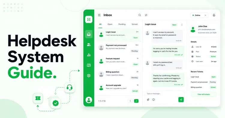
Manage Customer Support with Unlimited Tickets
Seamlessly manage customer support, respond promptly, and foster customer loyalty. Elevate your business’s reputation and satisfaction levels today.
- Unlimited Tickets
- Unlimited Users
- Data Analysis Reports
- WooCommerce Integrations
- WebHook Integrations
- Unlimited Email Piping
Frequently Asked Questions
What is the best knowledge base tool for WordPress?
For WordPress users, Support Genix is the best choice because it integrates fully with your site’s database, users, and ticketing system, eliminating the need for expensive external SaaS subscriptions. It also includes AI article generation and chatbot training.
What should be on the homepage of a knowledge base?
A large search bar (at the top), 3-6 main category icons (e.g., “Getting Started,” “Billing,” “Troubleshooting”), a list of “Most Popular Articles,” and a clear CTA to submit a ticket if users need human help.
Internal vs. External Knowledge Base: What’s the difference?
An External KB is for customers (product guides, FAQs, troubleshooting). An Internal KB is for employees (SOPs, HR policies, tone guidelines). Support Genix allows you to manage both from a single dashboard with role-based permissions.
How many articles do I need to launch?
You don’t need hundreds. Launch with the “Top 20” questions your support team gets asked most often. You can use Support Genix’s AI writer to generate these quickly and then iterate based on search analytics.
How often should I update my knowledge base?
Review and update high-traffic articles quarterly. Set a “last updated” date on every article. If an article is more than 12 months old, it probably needs updating.
Conclusion: Stop Answering the Same Questions
A great knowledge base is the only support channel that gets better as it gets bigger. It works while you sleep, training your customers and your AI chatbots simultaneously.
Unlike hiring more support agents (which adds cost), every article you publish continues to deflect tickets indefinitely. A well-maintained knowledge base is the ultimate leverage.
Key Takeaways:
- Search first: Users will search before they browse. Prioritize searchability.
- Connect to support: Link articles in your support replies. Show customers the answer even as you resolve their ticket.
- Measure deflection: Track which articles prevent tickets from being submitted.
- Update regularly: An outdated article is worse than no article.
- Use AI: Let AI tools draft articles, but have humans review them for accuracy and brand voice.
If you are ready to build a help center that actually reduces your ticket volume, start with a tool that integrates with your workflow. Ready to build your own?
Get started with Support Genix today. Its AI-powered features, BetterDocs migration tool, unlimited articles, and integrated ticket management make it the smartest choice for growing businesses.
With Support Genix, you’re not just creating a knowledge base, you’re building a 24/7 support system that scales with your business.